NEXTCREST
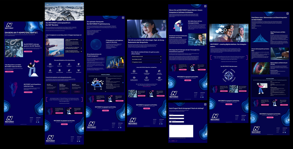
Development of the overall appearance for the IT consultancy NEXTCREST. From workshops and corporate design to the sitemap and website.
Introduction
NEXTCREST is a small, successful IT consultancy with a surprisingly large number of key accounts in the DACH region.
The problem
The ongoing battle for skilled professionals which has been, continues to intensify. In the IT sector in particular, small and medium-sized companies like NEXTCREST are finding it difficult to be
recognised as relevant employers
The idea ‘When everyone zigs you zag.’
Unfortunately, websites of IT consulting companies often appear generic and monotonous. Although they are informative, visiting the site is not a ‘joy of use’ and reads as excitingly as a
telephone directory. At NEXTCREST, we want to surprise with a lot of creativity and contemporary design. We consciously stand out from the crowd: with a holistic communication concept, the
courage to use colour and uncomplicated texts.
Role: freelance UX designer
Disciplines: UX design and UI design, consulting, workshop, graphic design, conception
Tools

Figma
Miro
Adobe Photoshop
Adobe Illustrator

It starts with a sprint workshop
In order to get a better understanding of the IT industry and to be able to advise NEXTCREST well, we held an uncomplicated kick-off workshop. The NEXTCREST team talked freely about hurdles and
goals.
One realisation from the workshop is that recruitment is the most urgent problem. They can offer their employees an attractive job, but unfortunately this often remains vacant.

previous Logo

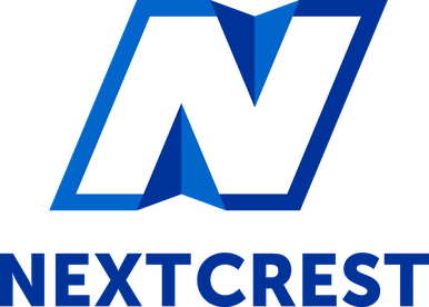
new Logo
The Logo
From the mountain range to the programming language
The previous logo focussed heavily on the company name (Next Crest) and not on the company's business field. During the workshop, it became clear that we wanted to take a new approach.
In the new development, we stringly refer to the IT industry. The ‘N’ is formed by two cursors and two square brackets. Combined with a modern, sans serif font and a strong blue colour.
Sitemap
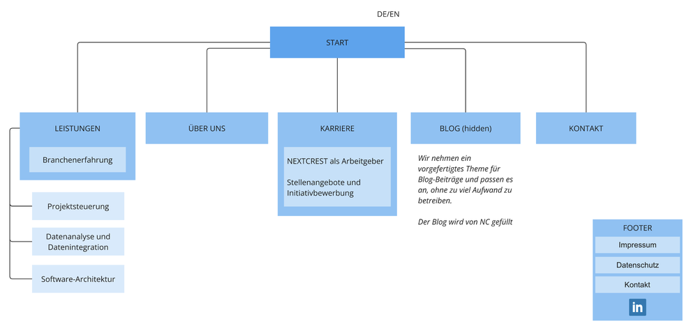
The new website has a manageable number of pages at launch. It will later be expanded to include a blog. The careers page will take on a special significance. Current job vacancies will be directly visible instead of being linked to job platforms. Applications can be sent informallyvia mail.
Style Guide
By working closely with the programmer, there is no need for a detailed design system. The elementary components and information are bundled in the style guide. Together with detailed Photoshop files, it serves as a handover for the development.


